
How to Choose the Perfect Colour Scheme for Your New Website
Choosing the right colour scheme for your new website can be a daunting task, especially if you’re not a design expert. You know that colours have a powerful impact on how visitors perceive your brand, but where do you start? What if you make the wrong choice and it turns potential customers away instead of drawing them in?
You’re not alone in this struggle. Many small business owners feel overwhelmed when it comes to designing their website, but the good news is, selecting a colour scheme doesn’t have to be complicated. In this guide, we’ll walk you through the process of choosing a colour palette that not only looks great but also aligns with your brand and resonates with your audience. Plus, we’ll provide you with a few example colour palettes to inspire your own design.
By the end of this post, you’ll have the knowledge and confidence to pick the perfect colours for your website, ensuring it makes a positive, lasting impression on your visitors.
Why Colour Matters
Before diving into how to choose your colour scheme, it’s important to understand why colour matters. Colours evoke emotions, create associations, and influence how people feel about your brand. For example:
- Red can evoke passion, urgency, or excitement.
- Blue often represents trust, calmness, and professionalism.
- Green is associated with nature, growth, and health.
- Yellow can convey happiness, warmth, and energy.
These psychological effects mean that your colour choices can directly impact how users interact with your site. A well-chosen colour scheme can lead to higher engagement, better brand recognition, and even increased conversions.
Steps to Choosing the Perfect Colour Scheme:
1. Understand Your Brand Identity
The first step in choosing your website’s colour scheme is to have a clear understanding of your brand identity. What does your brand stand for? What emotions do you want to evoke? Who is your target audience?
For example, if you’re a financial consultant, you might want to convey trust and professionalism, making blue a suitable primary colour. On the other hand, if you’re running a health and wellness blog, green might be a better choice to represent growth and vitality.
Take some time to define your brand’s core values and how you want to be perceived. This will guide your colour choices and ensure they align with your overall brand strategy.
2. Choose a Primary Colour
Once you have a clear understanding of your brand identity, it’s time to choose a primary colour. This is the colour that will dominate your website and be most associated with your brand.
Your primary colour should resonate with your target audience and reflect the emotions you want to evoke. To find inspiration, look at other websites in your industry and consider what colours they use. You can also use tools like Adobe Color to explore different colour options and see how they work together.
3. Select Complementary Colours
After deciding on your primary colour, the next step is to choose complementary colours that will enhance your design. Complementary colours should contrast with your primary colour to create visual interest without clashing.
A common approach is to use the 60-30-10 rule, where:
- 60% of the colour scheme is the primary colour,
- 30% is a secondary colour (often complementary to the primary colour),
- 10% is an accent colour that adds a pop to the design.
For example, if your primary colour is blue, a complementary colour might be orange or yellow, and an accent colour could be a neutral like grey or white. Tools like Coolors or Canva’s Colour Wheel can help you find complementary colours that work well together.
4. Consider Accessibility
When choosing your colour scheme, it’s important to consider accessibility. Your website should be easy to read and navigate for all users, including those with visual impairments.
Ensure there is sufficient contrast between text and background colours. The Web Content Accessibility Guidelines (WCAG) recommend a contrast ratio of at least 4.5:1 for normal text and 3:1 for large text. Tools like Contrast Checker can help you test your colour choices for accessibility.
5. Test Your Colour Scheme
Before finalising your colour scheme, test it in different scenarios to see how it looks. Apply it to your website’s mockups to create prototypes. Consider how your colours work together on different devices and in various lighting conditions.
It’s also a good idea to get feedback from others, especially those within your target audience. What might look good to you could be perceived differently by others, so gathering feedback can help you refine your choices.
6. Use Colour Scheme Tools
If you’re still unsure about your colour choices, there are plenty of online tools available to help you create a cohesive colour scheme. Here are a few popular options:
- Adobe Color: Offers a colour wheel and various colour harmony rules to create balanced palettes.
- Coolors: A super-fast colour scheme generator that allows you to lock colours you like and randomise the rest.
- Canva Colour Palette Generator: Lets you upload an image and automatically generates a colour palette based on the image’s colours.
These tools can be a great starting point and help you visualize how different colours work together before you commit to a scheme.
Choosing the Right Hosting for Your Colour-Rich Website
Now that you’ve chosen the perfect colour scheme, it’s essential to ensure your website performs as beautifully as it looks. A reliable hosting provider can make all the difference in loading speeds and overall user experience. If you’re still on the fence about which hosting provider to choose, check out our guide to choosing the best hosting for your website for expert advice tailored to small business owners like you.
Example Colour Palettes for Inspiration
Now that you’ve learned how to choose a colour scheme, it’s time to get inspired. Below are a few example colour palettes that can serve as a starting point for your design. Whether you’re looking for something bold and vibrant or subtle and sophisticated, these palettes offer a range of options to suit different brand identities.
1. Cool and Trustworthy Blue
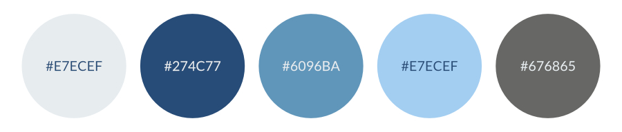
- Primary Colour: Deep Blue (#274C77)
- Secondary Colour: Sky Blue (#6096BA)
- Accent Colour: Light Grey (#E7ECEF)
- Background Colour: Soft Grey (#E7ECEF)
- Text Colour: Slate Grey (#676865)
This blue palette is perfect for businesses that want to convey trust, professionalism, and reliability. The deep blue provides a strong foundation, while the sky blue adds a touch of softness. The light grey and soft grey background ensure a clean and modern look, with slate grey text for readability. This palette is ideal for industries like finance, technology, or consulting, where a calm and trustworthy image is key.
2. Fresh and Natural Green
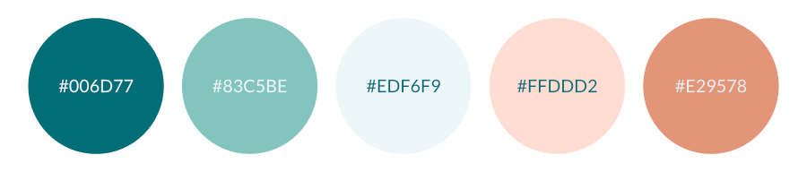
- Primary Colour: Teal Green (#006D77)
- Secondary Colour: Soft Mint (#83C5BE)
- Accent Colour: Light Aqua (#EDF6F9)
- Background Colour: Peachy Pink (#FFDDD2)
- Highlight Colour: Warm Coral (#E29578)
This green palette evokes a sense of growth, health, and sustainability. The teal green offers a strong, earthy base, complemented by the soft mint for a fresh, natural look. The light aqua and peachy pink add a soft and inviting feel, making this palette ideal for businesses in the wellness, organic, or eco-friendly sectors. The warm coral highlights can be used sparingly to draw attention to key elements, adding a touch of warmth and energy to the overall design.
3. Warm and Inviting Orange
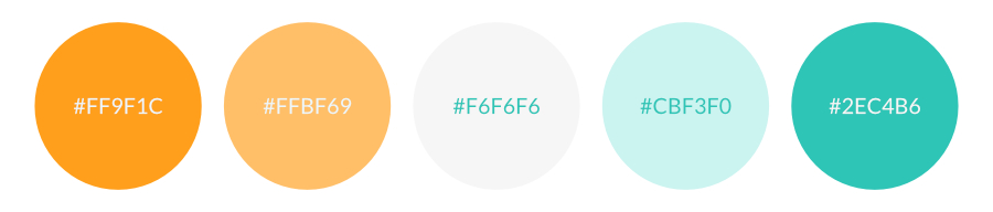
- Primary Colour: Vibrant Orange (#FF9F1C)
- Secondary Colour: Soft Orange (#FFBF69)
- Accent Colour: Light Grey (#F6F6F6)
- Background Colour: Mint Green (#CBF3F0)
- Highlight Colour: Teal (#2EC4B6)
This orange palette is energetic and welcoming, perfect for businesses looking to create a friendly, approachable, and dynamic online presence. The vibrant orange grabs attention and brings warmth, while the soft orange adds a softer, more subdued tone. The light grey offers a neutral base, and the mint green background provides a fresh and modern feel. The teal highlight adds contrast and can be used to emphasize important elements, making this palette particularly effective for creative industries, hospitality, or community-focused websites.
Choosing a colour scheme for your new website might seem overwhelming, but by following these steps, you can create a visually appealing and cohesive design that resonates with your audience. Remember, your colours should reflect your brand identity, appeal to your target audience, and be accessible to all users.
With the right colour scheme and a reliable hosting provider, your website will not only look stunning but also provide an excellent user experience. Now, go ahead and start experimenting with colours—you’ll be surprised at the impact the right palette can have on your brand’s online presence.
If you found this guide helpful, don’t forget to share it with others who might be embarking on their own website design journey!