Colour Psychology in Web Design: Creating Emotional Connections Through Colour
Have you ever wondered why certain websites make you feel calm, energized, or even hungry? This is the magic of colour psychology in web design. Colours aren’t just visually appealing; they play a crucial role in shaping our emotions and behaviours online. Whether you’re designing a personal blog or a corporate website, understanding how to use colours effectively can help you craft meaningful emotional connections with your audience.
In this post, we’ll explore the fascinating world of colour psychology in web design. You’ll learn how different colours influence user emotions, enhance engagement, and improve the overall user experience. We understand that choosing the right colours can be challenging, especially when aiming to align them with your brand’s message and audience expectations. Let’s delve into the vibrant palette of web design and uncover how to make informed colour choices that resonate with your visitors.
Understanding Colour Psychology in Web Design
What is Colour Psychology?
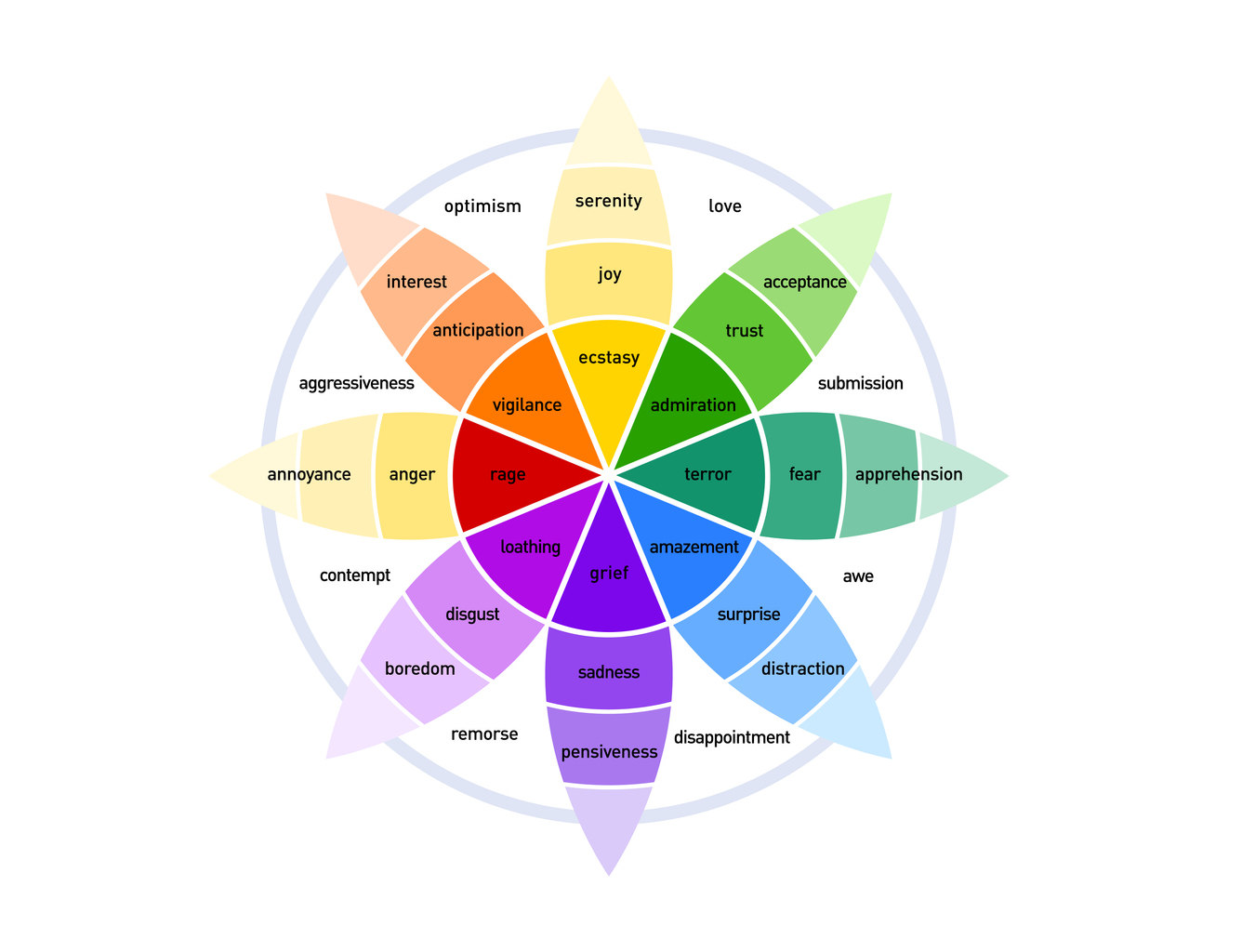
Colour psychology is the study of how colours affect human behaviour and emotions. In web design, it’s about selecting colours that not only look good but also evoke the desired emotional response from your audience. According to Psychology Today, colours can influence our moods, perceptions, and even decision-making processes.
The Impact of Colour on Users
Colours can significantly impact how users perceive your website and interact with it. For example, blue often conveys trust and professionalism, making it a popular choice for corporate websites. On the other hand, vibrant colours like red and orange can create a sense of urgency or excitement, which is effective for call-to-action buttons and promotional banners.
Key Colours and Their Psychological Effects
Blue: Trust and Dependability
Blue is a universally liked colour that conveys trust, reliability, and professionalism. It’s commonly used by financial institutions, healthcare providers, and tech companies. Websites like Facebook and LinkedIn utilise blue to establish a sense of security and dependability.
Red: Energy and Passion
Red is a powerful colour that evokes strong emotions such as passion, excitement, and urgency. It’s ideal for creating a sense of urgency in sales and promotions. However, excessive use of red can be overwhelming, so it’s best used as an accent colour.
Green: Growth and Health
Green is associated with nature, growth, and health. It’s a calming colour that can promote relaxation and balance. Green is often used by eco-friendly brands, wellness websites, and financial services to convey sustainability and growth.
Yellow: Optimism and Happiness
Yellow is a bright and cheerful colour that symbolizes optimism and happiness. It can grab attention and stimulate mental activity, making it effective for highlighting important information. However, too much yellow can cause eye strain, so it should be used sparingly.
Purple: Luxury and Creativity
Purple combines the stability of blue and the energy of red, often associated with luxury, creativity, and sophistication. It’s frequently used in beauty products, creative industries, and high-end brands.
Orange: Enthusiasm and Confidence
Orange is a vibrant and energetic colour that conveys enthusiasm, confidence, and friendliness. It’s effective for encouraging action and can be seen in websites promoting events, sales, and community engagement.
Applying Colour Theory in Web Design
Understanding Colour Harmony
Colour harmony refers to the aesthetically pleasing arrangement of colours. Utilizing complementary, analogous, or triadic colour schemes can create a balanced and visually appealing design. Tools like Adobe Color can help you experiment with different colour combinations to achieve harmony.
Creating Contrast for Readability
Ensuring sufficient contrast between text and background colours is essential for readability and accessibility. High contrast improves user experience and makes your content more accessible to people with visual impairments. Use tools like WebAIM’s Contrast Checker to verify your colour choices.
Consistency Across the Website
Maintaining a consistent colour palette throughout your website reinforces your brand identity and creates a cohesive user experience. Stick to a primary colour palette and use accent colours strategically to highlight important elements without overwhelming the user.
Enhancing User Engagement Through Colour
Guiding User Attention
Strategic use of colours can guide users’ attention to key areas of your website, such as call-to-action buttons, navigation menus, and important messages. For example, using a contrasting colour for your ‘Buy Now’ button can increase click-through rates.
Evoking Emotional Responses
Different colours evoke different emotional responses, which can influence user behaviour. Understanding your target audience and the emotions you want to evoke can help you choose the right colours to enhance engagement and drive conversions.
Building Brand Recognition
Consistent use of colours that align with your brand identity can enhance brand recognition and recall. Colours become a visual cue that helps users associate your website with your brand’s values and personality.
Practical Tips for Choosing the Right Colours
Know Your Audience
Understanding your audience’s demographics, preferences, and cultural backgrounds is crucial when selecting colours. Different cultures perceive colours differently, so ensure your colour choices resonate with your target audience.
Align Colours with Brand Identity
Your website’s colour scheme should reflect your brand’s personality and values. For example, a luxury brand might use rich, deep colours, while a tech startup might opt for sleek, modern hues.
Use Colour Psychology to Influence Behaviour
Leverage colour psychology to influence user behaviour, such as encouraging purchases, sign-ups, or shares. For instance, using green for eco-friendly products can attract environmentally conscious consumers.
Test and Iterate
A/B testing different colour schemes can provide valuable insights into what works best for your audience. Use analytics tools to measure the impact of colour changes on user engagement and conversions.
Understanding and applying colour psychology in web design is a powerful tool for crafting emotional connections with your audience. By carefully selecting and harmonising colours, you can influence user emotions, enhance engagement, and strengthen your brand identity. Remember to consider your audience, align colours with your brand, and continually test and refine your colour choices to achieve the best results.
Ready to transform your website with the right colours? Share this post with fellow designers and let’s create emotionally resonant web experiences together! Additionally, to stay ahead of the curve, check out our latest insights on Top Web Design Trends Shaping 2024