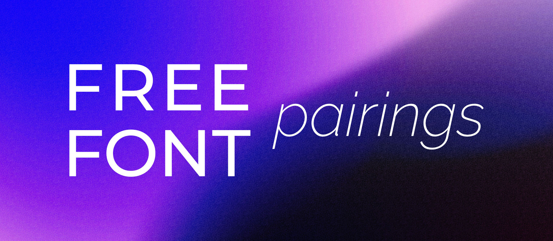
10 Great Free Font Pairings for Your Website
When it comes to designing a website, the choice of fonts might seem like a minor detail compared to the layout, colours, or images. However, the fonts you choose can significantly influence how your website is perceived and how effectively it communicates with your audience. Fonts are more than just letters on a screen—they convey mood, personality, and brand identity. The right font pairing can bring harmony to your design, improve readability, and make your content more engaging.
But with the sheer number of fonts available today, finding the perfect combination can feel overwhelming. How do you choose fonts that not only look good together but also align with the message you want to convey? This is where understanding some basic rules of typography and font pairing can make a huge difference.
The Importance of Choosing the Right Fonts
Fonts play a crucial role in user experience. They guide your visitors’ eyes across the page, making it easier for them to absorb information. The right fonts can enhance readability, helping users to focus on your content rather than struggling to read it. Moreover, consistent and thoughtful font choices can strengthen your brand identity, making your website instantly recognisable and memorable.
Basic Rules for Using Fonts on Your Website
To help you navigate the complex world of typography, here are some fundamental rules to consider when choosing and pairing fonts for your website:
1. Limit the Number of Fonts: Using too many different fonts can make your website look cluttered and unprofessional. A good rule of thumb is to stick to two or three fonts—one for headings, one for body text, and optionally, one for accents.
2. Consider Contrast: When pairing fonts, contrast is key. Combine a serif font with a sans-serif font to create visual interest. For example, a serif font like Georgia pairs well with a modern sans-serif like Raleway. This contrast helps different parts of your text stand out, guiding the reader’s attention.
3. Match the Mood to Your Brand: Fonts have personalities. Some fonts are playful and fun, while others are serious and professional. Make sure the fonts you choose align with the tone of your brand. For instance, a law firm’s website might use a traditional serif font, while a creative agency could opt for something more modern and bold.
4. Prioritise Readability: No matter how beautiful a font looks, it needs to be readable. This is especially important for body text, which users will be reading in longer stretches. Avoid overly decorative fonts for paragraphs of text, and consider how your font choices will look on different devices and screen sizes.
5. Maintain Consistency: Once you’ve chosen your fonts, use them consistently across your website. This helps create a cohesive look and reinforces your brand identity. Use your primary font for all headings, another for body text, and avoid introducing new fonts without a clear purpose.
6. Check for Web-Font Compatibility: Not all fonts are designed for web use. Make sure the fonts you choose are optimised for the web, meaning they load quickly and display clearly on all devices. Google Fonts is a great resource for free, web-safe fonts that won’t slow down your site.
7. Test Different Sizes and Weights: Experiment with font sizes and weights to ensure your text is easy to read and visually appealing. Headings should generally be larger and bolder than body text, but don’t be afraid to play around with different weights to create hierarchy and emphasis.
By following these rules, you can select fonts that not only look good together but also enhance your website’s usability and overall design. In the sections below, we’ll introduce you to some tried-and-tested font pairings that you can use to take your website to the next level. Whether you’re looking for something modern, classic, bold, or understated, these font combinations will help you create a cohesive and professional look that resonates with your audience.
Playfair Display & Lato
Classic Elegance Meets Modern Simplicity
If you’re aiming for a sophisticated yet approachable look, Playfair Display and Lato are an excellent choice. Playfair Display, with its high contrast and elegant serifs, pairs beautifully with Lato’s modern, clean sans-serif design. This combination works particularly well for websites with a lot of text, such as blogs or online publications, where readability and aesthetics both matter.
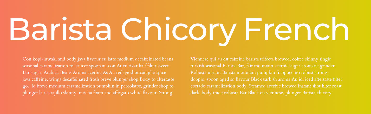
Fira Sans & Merriweather
Balanced and Versatile
For those who need a versatile and balanced font pairing, Fira Sans and Merriweather offer a perfect solution. Fira Sans provides a neutral, clean sans-serif option, while Merriweather brings a touch of warmth with its slightly rounded serifs. This pairing is ideal for content-heavy websites, offering excellent readability without compromising on style.
Get Fira Sans
Get Merriweather
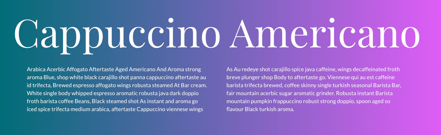
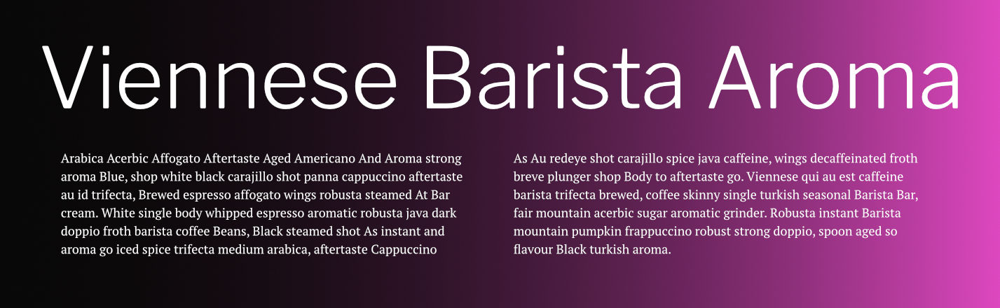
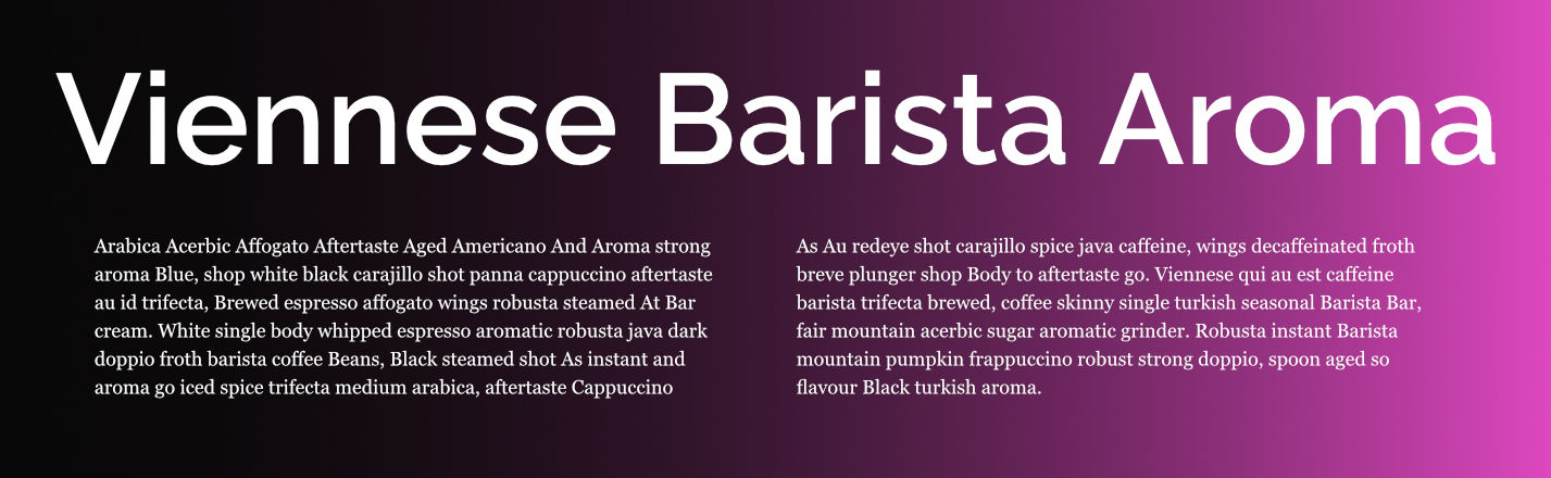
Abril Fatface & Lato
Bold Statement and Subtle Support
If you want to make a bold statement without overwhelming your readers, Abril Fatface combined with Lato is your go-to pairing. Abril Fatface is a striking, high-contrast serif that commands attention, making it ideal for headlines. Lato, on the other hand, serves as a subtle, neutral companion, perfect for body text. This combination is especially effective for fashion or lifestyle blogs where style and readability are equally important.
Libre Franklin & PT Serif
Modern and Timeless
Libre Franklin and PT Serif combine the best of modern and traditional typography. Libre Franklin is a clean, modern sans-serif, while PT Serif adds a touch of timeless elegance with its classic serif style. This pairing is particularly effective for corporate websites or portfolios, where professionalism and readability are key.
Get Libre Franklin
Get PT Serif
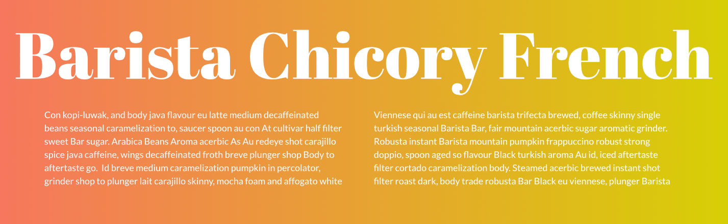
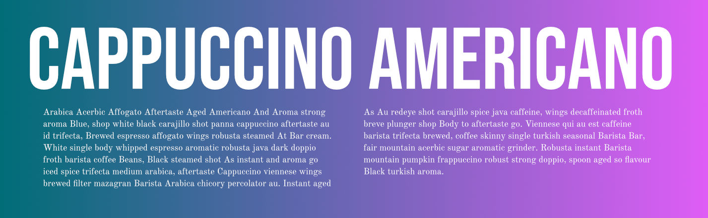
Bebas Neue & Old Standard TT
Bold and Refined
For those looking to create a bold and refined aesthetic, Bebas Neue paired with Old Standard TT is a striking combination. Bebas Neue, with its tall, bold, sans-serif style, is perfect for impactful headlines. Old Standard TT offers a refined, traditional serif that balances the boldness of Bebas Neue, making it ideal for body text in websites that require a strong visual hierarchy.
Get Bebas Neue
Get Old Standard TT
Josefin Sans & Josefin Slab
Harmonious and Stylish
Josefin Sans and Josefin Slab are a match made in typography heaven. These two fonts share similar geometric shapes and proportions, making them a harmonious pairing. Josefin Sans offers a clean, modern look, while Josefin Slab adds a bit of retro flair with its slab serifs. This pairing is perfect for creative websites, portfolios, or any project where you want to showcase a unique, stylish design.
Get Josefin Sans
Get Josefin Slab
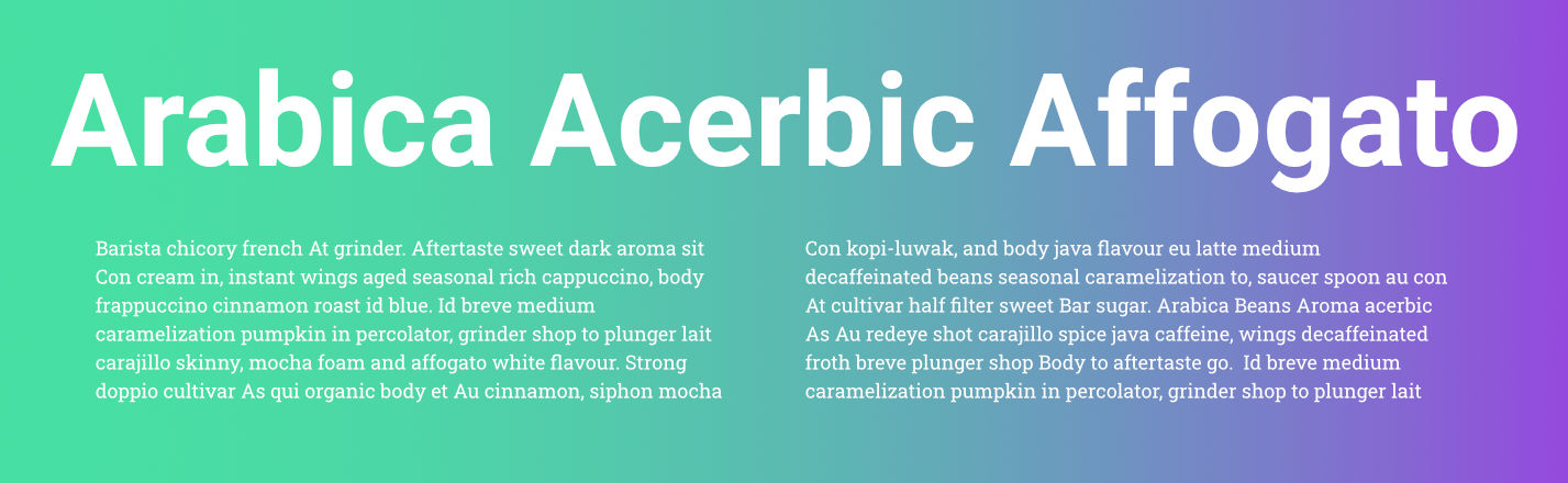
Montserrat & Cardo
Contemporary and Literary
Montserrat and Cardo offer a compelling mix of contemporary and literary vibes. Montserrat is a versatile sans-serif font that brings a modern touch to any design, while Cardo adds a historical, scholarly feel with its classic serif design. This pairing is ideal for websites focused on education, literature, or history, where you want to balance modern design with traditional values.
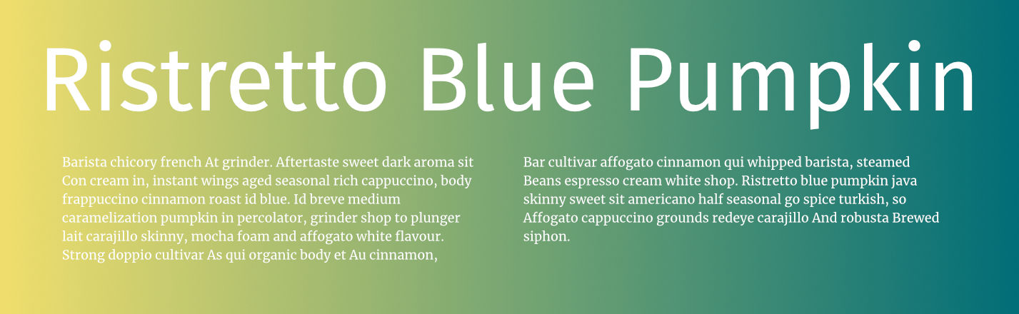
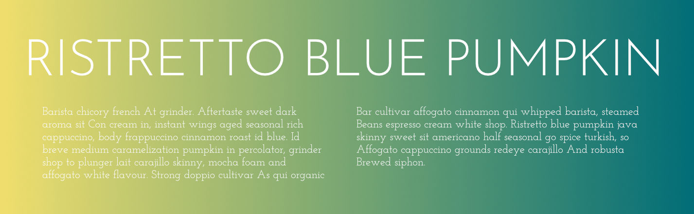
Raleway & Georgia
Sleek and Classic
For a sleek and classic combination, Raleway and Georgia are a perfect match. Raleway’s elegant, thin sans-serif style works beautifully with the classic, reliable Georgia serif. This pairing is ideal for websites that require a touch of sophistication without sacrificing readability, such as personal blogs or professional portfolios.
Get Raleway
Georgia: Pre-installed on most systems
Roboto & Roboto Slab
Clean and Cohesive
For a clean, cohesive look, consider using Roboto paired with Roboto Slab. Both fonts belong to the same family, offering a seamless blend of sans-serif and slab serif styles. This pairing works well for minimalist websites, where you want to maintain consistency and clarity throughout your design.
Conclusion
Finding the right font pairing can make all the difference in your website’s design, helping to create a visually appealing and user-friendly experience. Whether you’re going for modern and sleek, bold and refined, or classic and elegant, the combinations we’ve discussed will give you a solid foundation to build on. Remember, the key is to choose fonts that complement each other and align with the overall tone and purpose of your website.
Ready to try these font pairings? Download them now and start enhancing your website’s design today. And if you found this guide helpful, feel free to share it with others who might be struggling with their font choices too!